Minimising the volume of image data transferred on opening a web page can dramatically improve performance, benefiting both the visitor and website owner.
Fast web pages encourage visitors to explore a web site's content.
Owners appreciate the boost to their SEO ranking that results when most of their pages load within Google's 2.5 second speed threshold. Google calls this Largest Contentful Paint. It measures how long it took for the browser to paint the largest element appearing on the page.
Since most website content by volume is images, delivering them as small as possible without compromising quality is an over-arching goal in meeting the 2.5 seconds target.
You can corroborate the details in this article by clicking the icon top right. Available on all devices, it lists the resources, including transfer size, that have been downloaded by your browser to view the page content. Here we're concentrating on images, but you can also see performance metrics of fonts, css and javascript.
Digital Asset Manager
Image technology on the web is an evolving and surprisingly complex topic that you can't reasonably solve on your own.
This platform uses Cloudinary's Digital Asset Management service because it offers advanced features to help meet our performance goals.
Image categories
Image optimisation should treat the first image in the page very differently to any other images. Our over-arching goal is to ensure that all images, first or otherwise, are sent to the visitor's browser as small as possible without sacrificing quality.
The first image on a web page will likely be that page's Largest Contentful Paint element. The first optimisation is to make sure this first image is loaded eagerly and never lazily.
A lazily loaded first image will have a disastrous impact on the page's LCP metric since by design it is only fetched when reaching the visitor's viewport after the rest of the page's resources have been loaded.
Therefore, we need to fetch the first image as soon as the page starts loading, which can be achieved by setting the attribute fetchpriority="high" on the image element as defined in the HTML.
All other images should be defined in the HTML with the attribute loading="lazy"
Convert image to AVIF
The most efficient image format in terms of compression is AVIF. This became a baseline feature in January 2024, meaning that since then all major browsers support it.
It represents a huge improvement over the old JPEG format and is significantly more efficient than WEBP.
Therefore, automatically converting all images to AVIF with an 80% quality setting is an important optimisation.
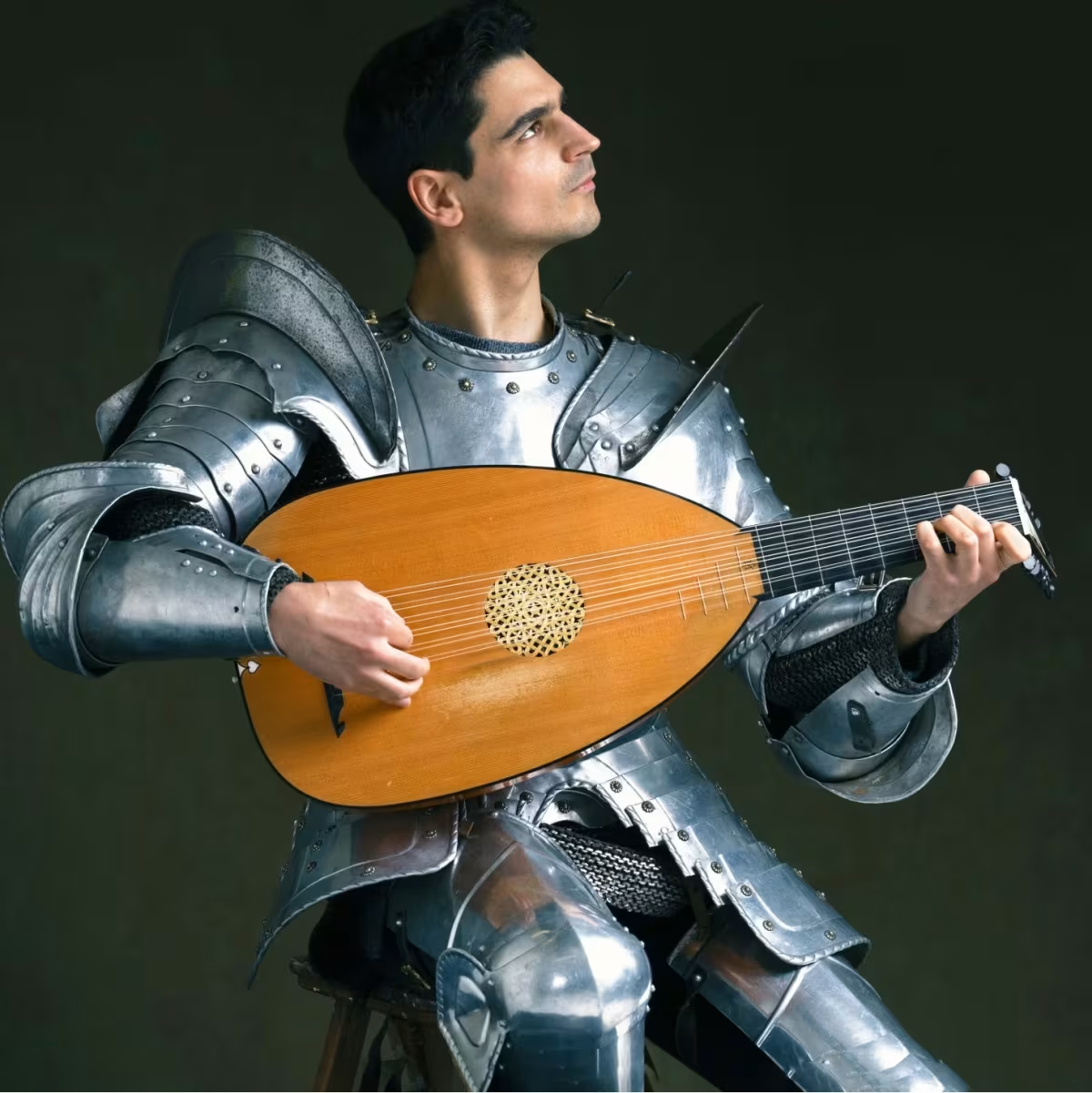
The image at the top of this page for example is converted from the original JPEG (369K) to AVIF (67K) already saving 300K.
80% compression is a sweet spot providing significant data savings whilst not compromising perceivable image quality. In many cases, images could be compressed further, but it depends on specific characteristics of the image. In order to deliver the greatest benefit to the greatest number the website building platform opts for 80%.
First image HTML
The editor creates a single url source attribute for the <img> element when it is inserted into the page.
If we published the page unchanged all visitors would download the image at its full 1200px resolution of 67K.
While that's fine for device viewports of 1200px or more, it's no good for visitors on mobile phones who would download the full 67K of image data.
This would be a waste of data for devices with viewports narrower than 1200px.
In order to optimise this we need to give the visitor's browser a range of resolution choices that allow it to download the least amount of data for their device's dimensions.
Cloudinary can provide a range of image resolution breakpoints based on a defined size increment. The website building platform is configured to have Cloudinary deliver up to 10 resolution breakpoints at approximate 10K increments within the range 200px to 1200px.
For this specific image, the breakpoints and image sizes are:
| Breakpoint | Image Size |
| 200 | 6K |
| 356 | 14K |
| 479 | 22K |
| 597 | 30K |
| 706 | 40K |
| 803 | 47K |
| 917 | 50K |
| 1154 | 64K |
| 1200 | 67K |
With this information the deployed image element is modified to include the srcset attribute:
srcset="
https://res.cloudinary.com/mrbapex/w_1200/sami-photo_n7dreu 1200w,
https://res.cloudinary.com/mrbapex/w_1154/sami-photo_n7dreu 1154w,
https://res.cloudinary.com/mrbapex/w_917/sami-photo_n7dreu 917w,
https://res.cloudinary.com/mrbapex/w_803/sami-photo_n7dreu 803w,
https://res.cloudinary.com/mrbapex/w_706/sami-photo_n7dreu 706w,
https://res.cloudinary.com/mrbapex/w_597/sami-photo_n7dreu 597w,
https://res.cloudinary.com/mrbapex/w_479/sami-photo_n7dreu 479w,
https://res.cloudinary.com/mrbapex/w_356/sami-photo_n7dreu 356w,
https://res.cloudinary.com/mrbapex/w_200/sami-photo_n7dreu 200w
"
The browser now has 10 different resolutions to choose from but needs an additional sizes attribute in order to know how big an area the image will eventually occupy on the visitor's device.
We therefore tell the browser that this particular image is 504px wide when the viewport is at least 1200px wide and 50% of the device width when the viewport is less than 1200px.
sizes="(width>=1008) 504px,50vw"Why 1008? This is based on the maximum width of the container in which image content is included less any padding applied to the sides of the container. Pages on this page are configured with a maximum container width of 1040px and 16px padding, hence 1040-16-16 = 1008
Why 504px? After inserting the image on this page it was resized in the editor to occupy 50% of its container size, hence 0.5*1008 = 504px
Why 50vw? When the viewport width is less than 1008px the width of the image rendered on the device becomes 50% of the viewport width. On a 360px wide mobile phone, for example, this would translate to 0.5*360 = 180px
Which image resolution from the srcset list will the browser choose? Actually there is no definitive answer as each browser is at liberty to apply their own selection criteria. For example, Chrome always chooses an image in cache if available even if it's much greater resolution, Safari never downscales an image, Chrome chooses the closest resolution to the device's viewport width, etc.
Notwithstanding inconsistencies between different browsers, the goal is to give the browser, whichever it is, as much information as possible for it to make an optimal choice.
For example, on a cheap old 360px Android mobile phone, Chrome is likely to choose the 479px resolution image if the phone's device pixel density ratio is 2.
The browser works out that the image resolution on this viewport width is 180px and therefore chooses the closest 2x resolution from the srcset, i.e. 479px.
If you view this page on a mobile phone you should see that the browser has downloaded a small, lower resolution image, wheras on wider devices it will select a heavier, higher resolution image.
By defining the images as responsive the browser automatically delivers the best quality image for the device's dimensions and capabilities thereby minimising the overall page size.
The icon top right also reveals the page's LCP score which should be well within the 2.5 second threshold, irrespective of the device used.
Remaining image HTML
For all remaining images, we have to set the sizes="auto" attribute. The srcset is calculated in the same way as for the first image.
Note that the editor always includes the height and width attributes of all images inserted into the page. This has two benefits:
sizes="auto"will work- the page will pass Google's Content Layout Shift metric
Note that adoption of sizes="auto" is about 73% at present (October 2025). Safari users will default to sizes="100vw" which isn't ideal but at least offers some level of additional optimisation until such time it is adopted.
The two images below have sizes="auto". Opening the page on a mobile will show that the browser has selected much smaller resolutions compared to the selections it makes on say, a laptop.
 |
Concluding remarks
Hopefully, you will have seen for yourself that configuring responsive images can very significantly reduce page weight whilst not impacting quality.
You may also have noticed that images are only downloaded at your request (excluding the first image of course). It's only when the visitor scrolls lazily loaded images into view that the browser actually fetches it over the network. Visitors should only pay what they ask for.
All of these optimisations are achieved exclusively in HTML.
No Javascript is involved in any part of the process.
A responsible website building platform provides all of the optimisations described here as an integral part of the platform. No one should be required to pay extra in order to give their visitors the best experience possible at the lowest cost to their devices, their data plans and the environment.